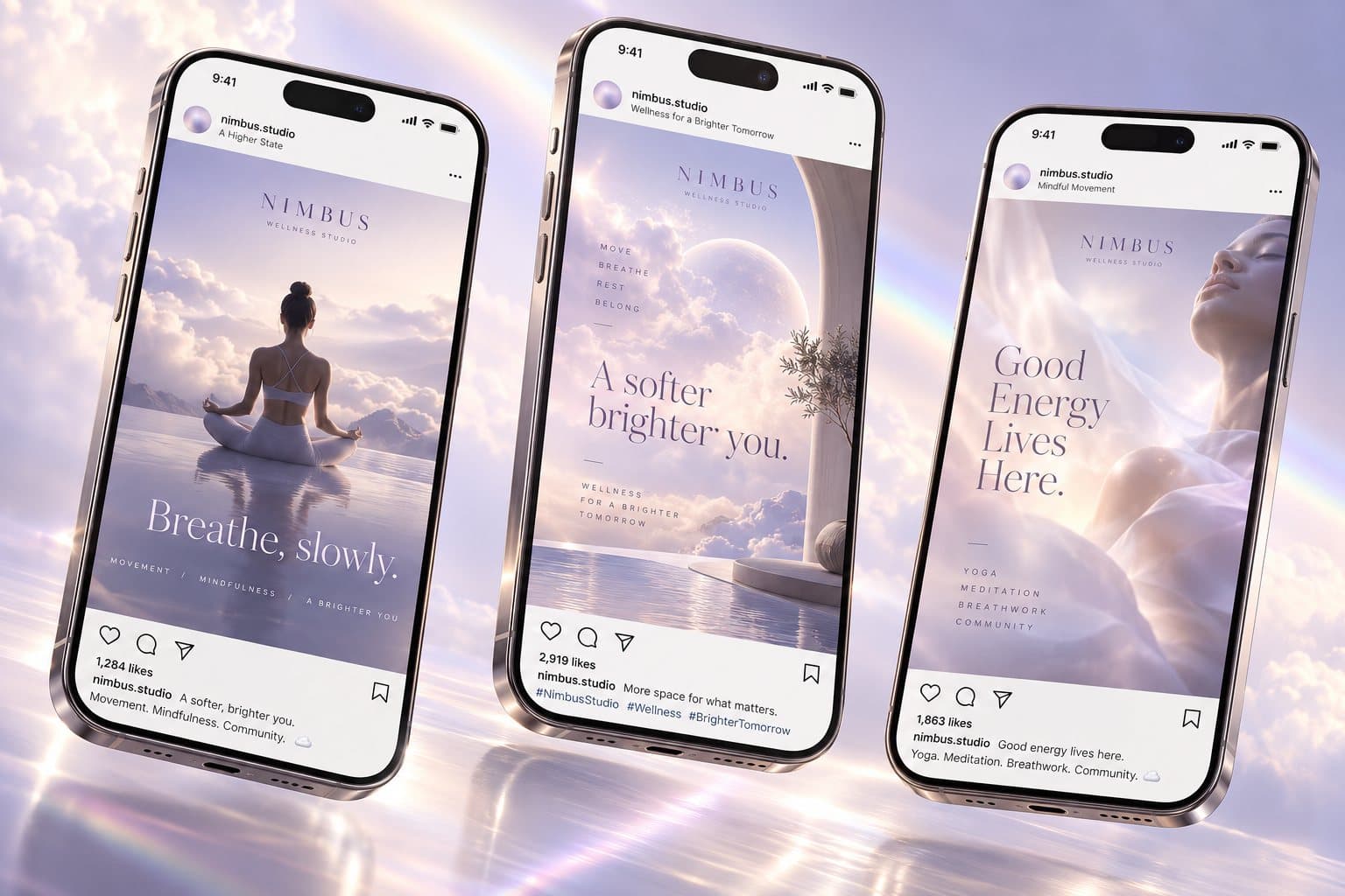
An identity and poster series for a coastal arts festival — designed to work as well on a street wall as on a phone.
(01) Client
Coral Coast Festival is a three-day celebration of Pacific music, craft and contemporary art.
(02) Challenge
Each year’s materials were designed by different volunteers, so the festival never built a recognisable look.
(03) Objective
Create a flexible festival system: a poster series, signage and social templates the team can reuse each year.
(04) Imago’s Role
Creative direction and graphic design.
- Event Branding
- Poster Series
- Signage
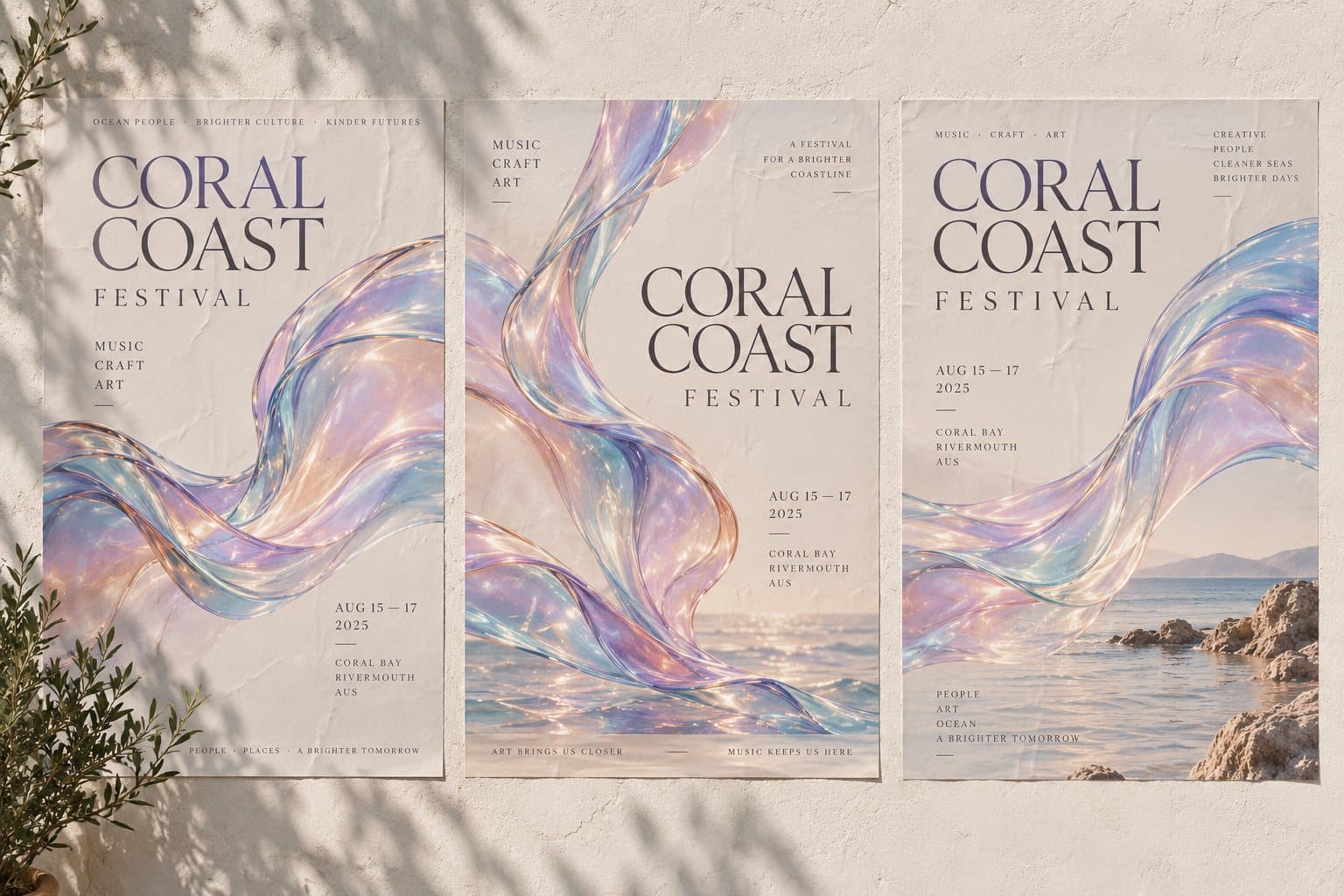
We built the identity around a single gesture, the curve of a wave caught in light, rendered as an iridescent ribbon across every touchpoint.
Typography pairs a refined serif with a crisp grotesk, so posters feel both cultural and contemporary.
A modular grid lets the festival team produce new formats without breaking the system.
Final work
- Sample project: results will appear here once real case studies are added.
Next project
Nimbus Studio